Saturday 30 January 2016

Zara || Models, Hair & Make up, Lighting etc... Zara Woman


LOCATION 

For the clothing that is modelled in the clothing section is clearly shot in a studio, with a white colourama. The flooring is often different, with a white textured flooring, this is used in the accessories and shoe sections. However in the editorial sections, the shots are more creative and have different colouramas that suit the mood of the shoot. Some of which are set on location, one image is on a roof top building, with a neutral texture. 

The clothes are the main focus here, if there are fussy backgrounds then it deflects the attention away from the selling point. I do think the location shots are very effective for the editorial, as the clothing hasn't been styled too much so that it is wearable. In the top left image, the burnt orange coat contrasts well against the neutral background. Even though white clothes are shown on the white background in the right image, it is still a strong image, and the customer can easily identify each garment, and still have an idea of how it can be styled.  The backgrounds don't necessarily have any furniture in, apart from the accessories pages and the shoes. They are either placed on boxes, or the models are sat on wooden stools, its created more of a three dimension, rather than being a flat image. Every other image of the shoes/accessories are presented in a different way, either propped up against a box, or on a different coloured contrasted colourama. 


HAIR 

The hair is left very natural looking, natural hair colours, with a wave. In some circumstances the hair looks windswept. Perhaps a stylist is on call with cardboard to flap it creating a breeze to create some more movement in the image, or a wind machine could have been used on a low setting. 


MAKE UP 

As well as the hair, the make up is too very natural. Glossy skin, blushed cheeks, stained or moisturised lips, a lick of mascara and eyeliner. As Zara do not sell beauty products apart from fragrances, this website is highly based in clothing, therefore I feel that Zara wants to remain the attention on the clothing and nothing else. 


MODELS
The models are very tall, slim, and natural looking. Their facial features are very soft, with a strong jaw line. The models ages range from 17-28 perhaps, they appear very youthful and fresh faced. Some with freckles, dark skin, pale skin, and mixed ethnicities. The facial expressions are quite serious, yet soft, some of them are quite flirtatious. From what I can see the models are not showing any tattoos. Quite sophisticated looking girls. The poses that the models do are not very far-fetched, they are relaxed, and are either walking, sat down, or have their hands in their pockets or by their side. There are a range of side profiles of the models, some looking straight into the camera and some looking away out of frame. 


LIGHTING

The lighting is very bright, with a good even exposure and contrast, the models faces are not over exposed and the colour pay off is presented very well. There are hardly any shadows, apart from some of the still life images, however this looks effective as it makes the accessories and shoes look more real and not so static. There are no flash backs on some of the shinier materials, such as the bags and the patent leather shoes. 


PRICES
With the customers having a mid-range income, the customer can spend more money, yet are getting their moneys worth by buying good quality garments at a low price. They can get more items of clothing instead of shopping around in different shops, Zara can cater for their needs, and provide them with a good shopping experience, both online and in store. Zara is classed as a 'designer boutique' store, however with a huge price difference to most boutiques. Even though H&M or Marks & Spencer are not luxury brands, they are still competitors within the same price range. It is about getting the balance right between high fashion and affordable prices. 

PHOTOGRAPHY
In the clothing sections, the majority of the images are photographed front on, in a lookbook style. Depending on the item of clothing the images range from close ups (accessories), mid length (tops and outerwear) and full length images (trousers and dresses). 


Friday 29 January 2016

Zara Website Design


The general layout of the Zara website, is minimal, simple and easy to navigate around. The Zara logo is situated in the top left hand corner, and is of the font 'Linotype Didot'. I feel that this logo really reflects well upon the brand, with the minimal feel to the clothing and flows well with the other typography on the website. The other font used throughout the website, is Helvetica.

The running colour theme is black and white, with the exception of the colours of the itms of clothing. The background of the website is white, with bold black typography. The text on the website is sometimes placed over the images, both in the editorials and in the clothing collection. The main thing that you notice whilst you are on the homepage, is the Zara logo, and the editorial images that are showing the recent designs.


The initial blog layout is that the categories of clothing ranges, e.g. Zara Man, TRF and Woman, are positioned on the left hand side, slightly below the Zara logo. The text 'SALE', 'COLLECTION SS16', and 'EDITORIALS' are in a bold Helvetica font. When the 'COLLECTION SS16' menu is pressed, a drop down menu appears with all of the items of clothing available to order. In the top right hand corner there are the usual and recognisable icons that appear on almost any other online shopping resource. The search bar, with a long, thin line indicating where the customer can type. There is a 'My Account' option for those who already have an account or those who would like to make one, in order to purchase clothing online. There is a 'Contact' button, which is for returns and complaints. Finally there is the shopping bag logo, where the customers can have all the items that they wish to purchase in one place. 


The images on the website are mostly portrait, however there are some that are landscape. On the homepage of the website, the images there are the zoomed in version and landscape version of the most recent editorial shoot. On the homepage it has the offers that are on at the moment. On this occasion, the 'Sale' has been advertised in a subtle, yet chic way. This keeps the Zara brand looking high end and almost a boutique name. The one thing that the Zara website doesn't have, are rollover images, and flashing images to advertise a sale. Zara are quite discreet with offers, and doesn't have any other marketing technique to gain more customers. There isn't any student discount opportunities, or codes that can be used for discounts.


In terms of image size, on the editorial page the layout is set out as if it were a blog. Often there are two images from the same editorial but different sizes, one is slightly bigger and the other is slightly smaller, and they either over lap or are placed a few millimetres apart. 


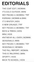
The editorials are separated out into the themes/season, and the different styles. For example, 'a new grunge' and 'mix and match style'. On the editorial tab on the left hand side, there is the list of the headings from each editorial, this could have been done for ease of access, and narrows down the target audience down a little bit more.    

At the bottom of the website there are four headings; 'Buying Guide', 'Follow Us', 'Policies', and 'Company', they have small headings underneath them with all of the terms and conditions and extra information that the customer may need to know. It also has there social media, and they are advertising their app. Their advertising is very subtle, the customer would have to scroll down right to the bottom in order to see these. 

Also in the editorial section there are some fashion GIFs, one of which was done in the studio. It is of a model who is pulling up her socks. It almost reflects a 'behind the scenes' feel, and can give the customers the feeling of an exclusive delve into the editorial shoot.


The website is App compatible, allowing to show gifs, videos and the editorials in a high quality. 

Thursday 28 January 2016

Zara Demographics

Reader Profile

  • Age range; 18-40 
  • Mid-ranged income
  • For people who are interested in the latest fashion trends, and wants fashionable, and on trend garments at affordable prices.
  • Cater for both a smaller size and plus-sized customers
  • Aimed at customers with a 'hectic' lifestyle, people with full time jobs
  • Heavily influenced and moved by European fashion
Zara sells quality, fashionable products at reasonable prices and based on product positioning. Zara also has the ability to design and finish products to be delivered in stores within 4 to 5 weeks, which allows quick turn around within the stores. The company is able to quickly respond to fluctuation customer demand in fashion trends. 

Zara's USP- Unique Selling Point
"To create or imitate the latest trends within a short two-week period: the new styles are available on sales floors for no longer than 4 weeks. In the case that a product does not sell, its inventory is immediately pulled from the floor and discontinued after one week". 
"Zara is said to have the most unusual strategy...its policy is zero advertising: the company preferred to invest a percentage of revenues in opening new stored instead".

Marketing Techniques/Brand Ethos

  • Affordable prices
  • Having a unique response to high market demands
  • Fast response to fashion trends 
  • "Every customer must be heard and we take care of every store as if it were the first one".
  • "The secret to Zara's attraction is that, although shopping there is cheap, it doesn't feel cheap. The stores are large, smart, modern and centrally located. The clothes are given room to breathe and unless there is a sale on, so are customers". 
  • "Zara does not compete on price. The usual Zara customer is not very price sensitive. Zara rather competes on fashion and they can only do that by having that quick response capability.  
Competition 
"Zara's choices about how to compete, particularly ones connected to its quick-response capability and the ways in which they create competitive advantage". 
Mango 
H&M 


http://www.slideshare.net/roula72/zara-final-search


Wednesday 27 January 2016

Unit Brief

Southampton Solent University
Assessment Brief Unit Code: FMS503 – Styling For Digital Publishing FHEQ Level 5 Faculty: FCIS School: Fashion
Digital publishing has revolutionised the way we interact with fashion media and retail. Through this assignment students will build on styling skills and translate and develop acquired knowledge both editorially and commercially for this ever-expanding medium.
Lectures, seminars and practical sessions will help to equip students with the knowledge and practical skills to create styled images required by various types of websites, apps and emerging media.
Students will discuss existing and emerging technology, looking at blogs, apps, and digital magazines published for tablets, ecommerce sites, film and animated fashion imagery such as Gifs.
Students will consider how digital publishing can both be used as an extension of print content for brands and magazines, or in exist its own right for online businesses, publishing houses and apps.
Students will be expected to utilise all the skills developed in make up & hair design, photography, Photoshop, InDesign, planning shoots and writing copy. To build on these skills students will be introduced within technical sessions to the MUSE creative software.
Students will consider all aspects of production with a specific site chosen from a list given. Students may choose to collaborate with a photographer, and possible collaboration with a hair and make-up artist but overall direction of the project is the sole responsibility of the student.
Aims & Objectives:
To differentiate the way of working between analogue and digital publishing assessing the added nuances required from digital publishing and expands on its potential.
To be able to identify the style and target-market of the chosen website/app/online-publication and produce appropriate outcomes.

Provide evidence of thorough research and development of ideas through a Digital Journal relating to the development of this project only, leading to a final portfolio for an online digital format.
Identify creative solutions that are appropriate to your identified audience and brief
Analyse comparative sites and their techniques and methodology and produce work that is of an appropriate visual standard
.
EXPECTED OUTCOMES (see further below for detailed criteria):
  1. OnlineDigitalJournalshowingResearchandDevelopment(Written/VisualAssessment1)
    Final blog post to be a 500 word Proposal outlining the concept and plan for your final Project (Written Assessment 1)

  2. FinalOutcome:PROJECT–consistingofdigitallayoutsforyouronlinefashionshoot(Project Assessment 2) call sheet and evaluation.
WORKPLAN GUIDELINE:
TASK 1: Explore and analyse digital media in fashion and its use of styling.

Explore new and existing uses of digital publishing including editorial, advertising and eCommerce – what is new and who is the best?
Look at various types of fashion imagery used online including photography, animation, gifs, film and new technology

Look at tablet use within the fashion industry including apps and digital magazine/newspaper editions Discuss and research any new trends in digital publishing
Expand on how to use various IT programmes include InDesign and Photoshop for digital publishing. Introduction to using MUSE within technical sessions.

Explore innovative concept developments showing awareness of trends in this medium and what looks old and what is cutting edge.

Task 2: Choose a digital site from the following to work for on your project and to research.
After a class discussion on each site you will need to select one of the following to research and style for from this list:
  • MatchesFashion.com men/women
  • Net-A-Porter / Mr. Porter
  • Burberry
  • Monki
  • Topshop / Topman
  • Zara
  • Gieves and Hawkes
& Other Stories Oki-Ni
LNCC
Seftons
Miss Guided
Wolf and Badger
More on consultation...
TASK 3: Formulate a comprehensive customer/reader profile for your chosen site to be submitted with your final presentation. This is to take the form of an online Journal, via a dedicated blog site for this project set up by the student, accompanied by a 500-word Proposal explaining the concept and thought processes behind the final Project.
Blog posts to include:
Reader Profile
Once you have selected a site from above you need to research the target market/readership. You must understand who it is aimed at and construct a customer profile. Who clicks on to the site? What is the demographic of the reader? Who is it marketed to?
Brand Ethos
What is the ethos of this site? Do they have a mission statement? What is their identity or image? What brands are used editorially or commercially within? What celebrities/models are used, if any? What is the overall graphic saying? What is their message? What is their unique selling point?
The Competition
Who are the sites rivals and how do they stand up to the competition?
Reflective observations
Log your thoughts and perceptions within your blog. Display your understanding of the medium and methods of styling and how they differ, if they do, from traditional publications.
Task 4: Research & Development of Magazine Content – Final Shoot and Digital Layout
The final result must be appropriate for that site and fit easily into its structure and main pages of style-lead content (links to examples below).

Choose the most relevant section of your chosen site to display your styling skills and grasp of the site’s specific style.
For the main Project we are looking for 5 finished shots/pages, plus a landing page, with accompanying headlines/straplines and captions. The styling, photography and layout of your digital pages must follow a house-style and format that is aligned with the ethos and design of the site and the digital publication chosen.

LANDING PAGE – The equivalent of a cover in Digital publishing that leads you to click onto the fashion story beyond.
This is the most important page to your Editor-in-Chief. It leads the visitor on into the site and must be engaging. It must be dynamic. Convey exactly what lies beyond and fit in with the rest of the site in both graphics and overall style. Here a gif or moving image may be used or an alternative viewpoint of a follow-on image. Simplicity is key to draw attention and engage.

Follow-on Fashion shoot – 5 shots/pages: Either in a carousel of images or all together to be clicked on to expand and explore.
Whilst planning your shoots you will need to consider studio vs. location and appropriate model selection. Making sure you choose an environment, props, and talent that will best depict the mood, story, and digital-site ethos. Also consider composition, pose, lighting, camera angle, and the weather. You can also use some still life within the 5 page fashion story (each image doesn’t have to feature a model).
Carefully consider postproduction options, retouching, cropping, frames, text, typeface, and additional graphics layered over etc.... 


Assessment AE1 – Research & Development via a Reflective Digital Journal + 500 word Proposal.
The first assessment will be evaluated on the Proposal for your finished project and on your digital journal of research and development via a reflective blog, specific to this module. This blog will provide you with an opportunity to discuss your thoughts and discoveries and gain ongoing feedback on your proposed concept for your editorial pages and show the development of your ideas and where they came from and will back up your finished proposal.
From the beginning of your blog discuss the research, concept development and design processes. The following points must be considered. You can use vlogging and screen capture in addition/instead of to text based posts:
Definition of your customer/reader profile.
Evidence of digital editorial, commercial considerations and layout including trend research.
Evidence of concept development for the shoot proposal from landing page to content.
Evidence of exploration and explanation of how your decisions are relevant to your chosen site and its customer, and how the content will help the site expand its market.
You must also be prepared to answer questions and respond to feedback effectively both from the peer group and via one-to-one tutorials.
You must send your Proposal and link to your finished blog to myCourse on 19th February 2015, before 10pm.

Assessment Criteria Checklist:
  • ❒  Communication and understanding of reader/customer profile, site ethos and concept development.
  • ❒  Presentation skills of your Journal including images to back up your copy.
  • ❒  Evidence of research.
  • ❒  Comprehensive Proposal that outlines the concept of your final project